Yorke Books


project details
brand identity
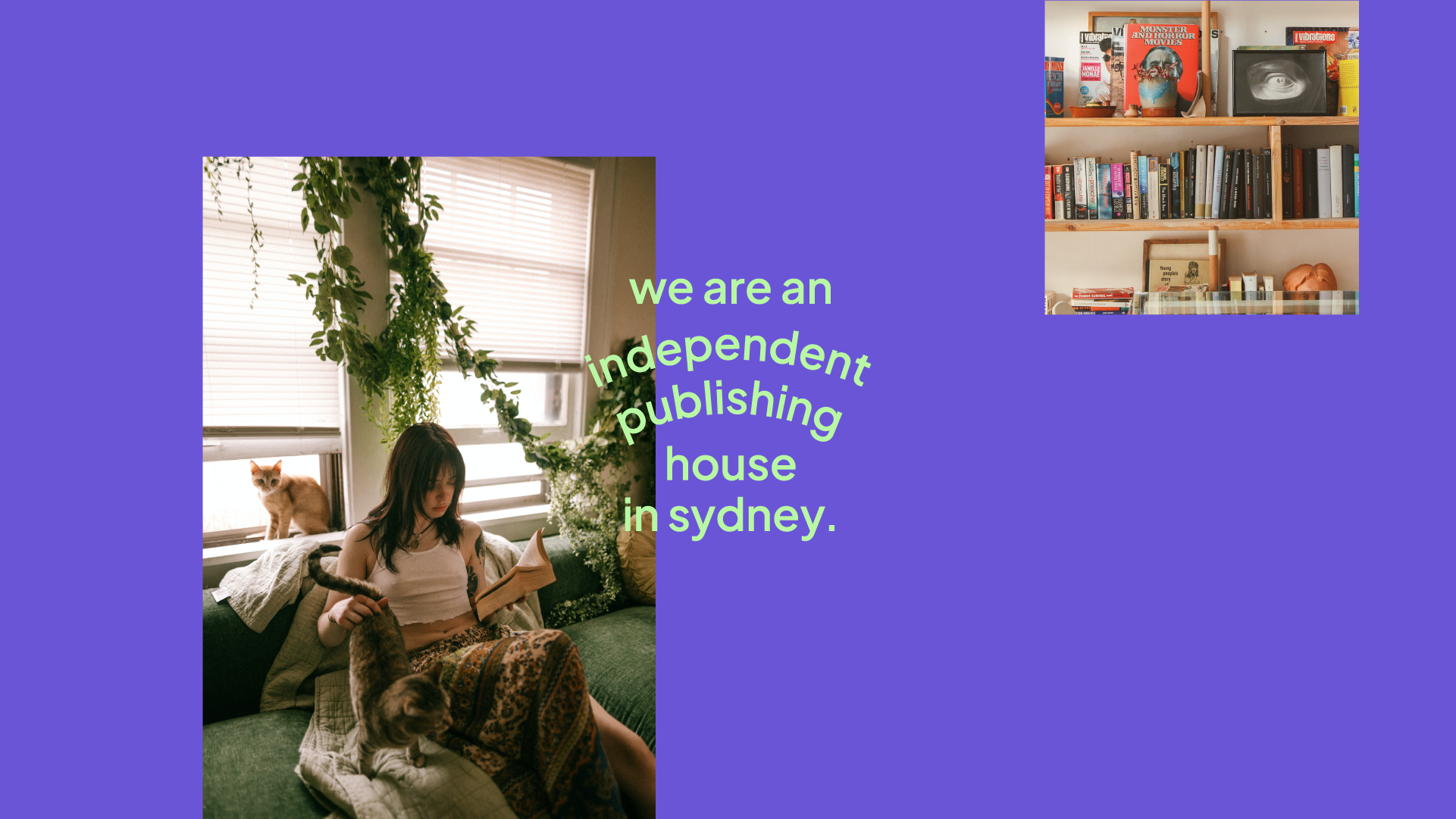
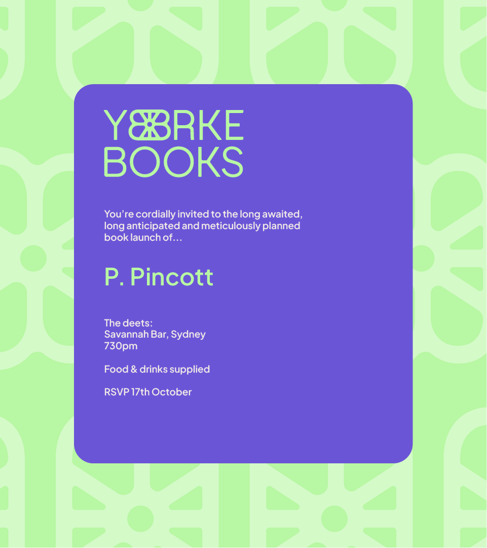
Yorke Books is a passion project, born from a. a love of books and b. seeing an old building, a former publishing house, in disrepair and imagining it as a thriving independent business that demanded a branding overhaul.
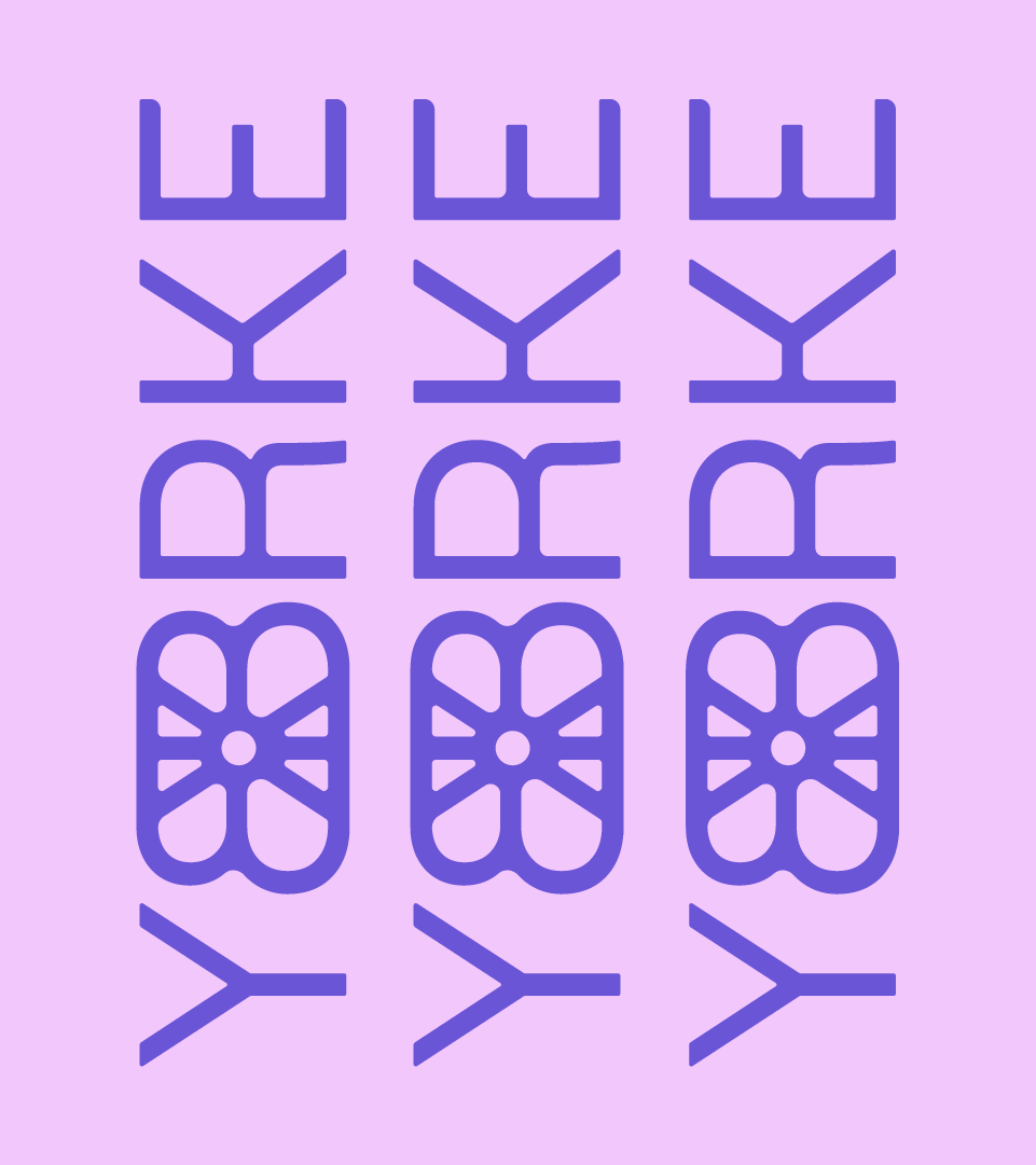
Bold and unapologetic, this brand demands attention. It demands to be noticed, much like the books and authors they publish. They have something to say and they’re not afraid to say it. With a monogram (left) embedded with meaning and story, this brand is here to disrupt and make their voice heard (or read).
the brief
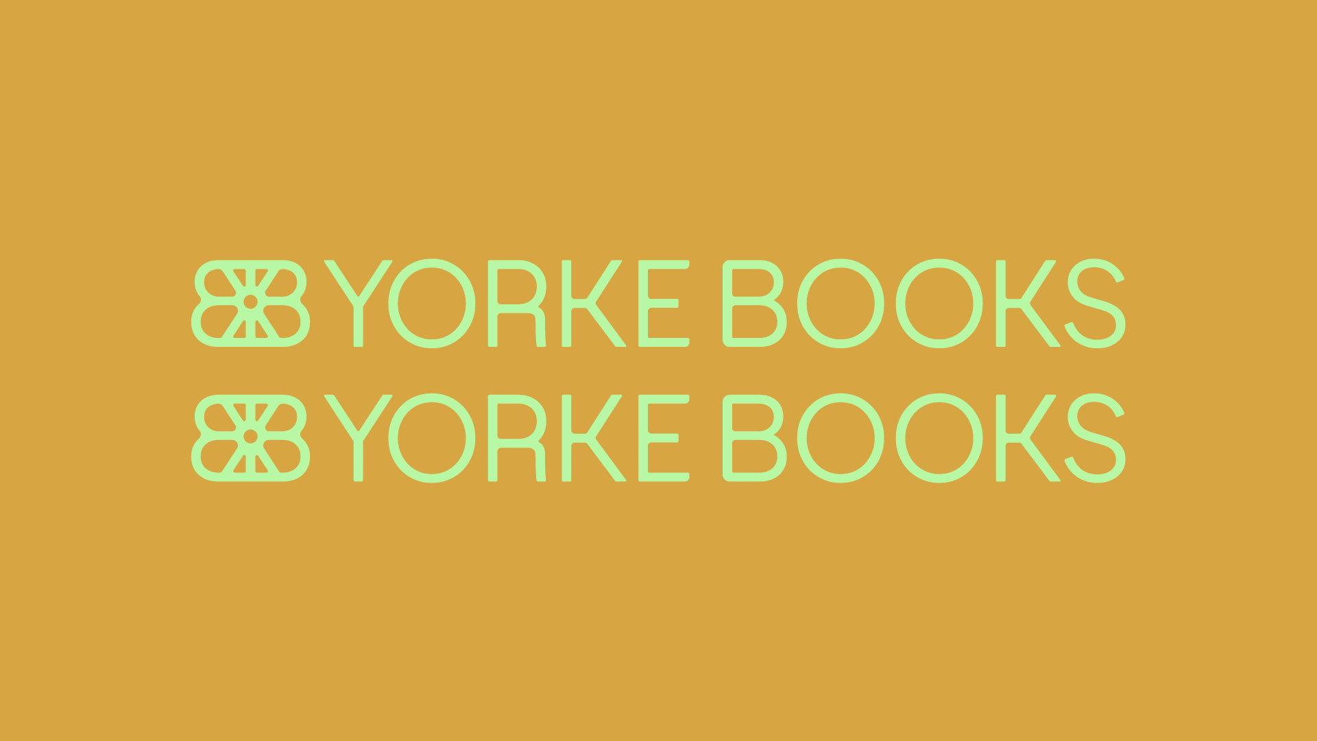
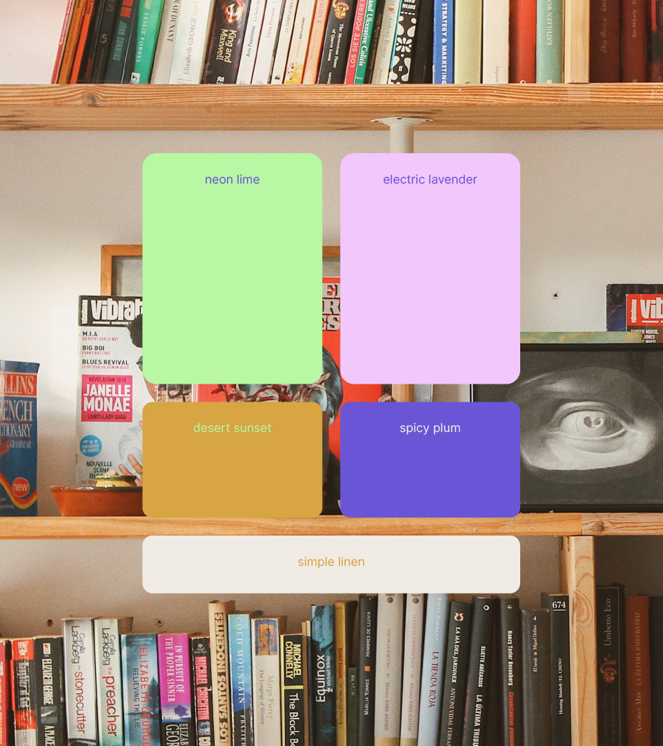
Born from a love of books, this passion project started with a font that couldn’t be denied. Structured, geometric and subtle, I tried to find ways to make it more approachable and soft whilst maintaining that edgy flair independent publishers are known for. Paired with a bold colour palette, this brand is meant to attract and inspire a younger, more conscious and free thinking demographic that can’t resist a good book.